
Beehive’s Climate Risk Modeling Documentation
This document describes Beehive's physical risk models, covering the overall modeling approach as well as the data sources and calculations used for each hazard type.
Table of Contents:
Model Overview
Beehive assesses physical climate risk to support regulatory reporting and risk management. Risk assessments are built using government, academic, and open-sourced data. Currently, physical risks from five climate hazards are assessed: cyclones, drought, floods, heat waves, and wildfires. Additional hazards such as blizzards and tornadoes are planned for later release. Assessments cover the full globe, with the exception of the north and south poles.
Data Sources and Climate Projections
Data for the assessments is sourced from peer-reviewed research conducted at universities across Asia, Europe, and the Americas, as well as from government agencies and research institutions including NASA, FEMA, the EU Joint Research Centre, and the Chinese Academy of Sciences. Climate projections are sourced from CMIP6 simulation results; for most hazards a 20+ member simulation ensemble is assembled, and data for the scenarios and time horizons of interest are extracted from the ensemble. Leveraging climate projections across a matrix of scenarios and time horizons provides a framework for understanding the risk associated with different emissions pathways.
Scenario and Time Horizon Selection
Risk is assessed across three of the scenarios defined by the 6th Assessment Report of the Intergovernmental Panel on Climate Change (IPCC). These scenarios specify both a socioeconomic narrative, and a radiative forcing level that is used for scenario simulations. The radiative forcing describes the climate impact of the scenario’s greenhouse gas emissions profile. The scenarios used here are: SSP1-2.6 (low emissions), SSP3-7.0 (medium-high emissions), and SSP5-8.5 (very high emissions), where SSP denotes a Shared Socioeconomic Pathway, and where the number after the hyphen describes the radiative forcing level. The forcing levels roughly correspond to Representative Concentration Pathway (RCP) scenarios that were used in earlier IPCC reports. These scenarios represent a range of future emissions trajectories commonly used in climate risk assessment and regulatory frameworks. Risk assessments cover three time horizons: 1 year, 10 years, and 30 years forward. The horizon choices provide both near-term operational risk insights and longer-term strategic planning perspectives.
Methodology Framework
Assessments are conducted at varying spatial resolutions, ranging from 400 meters in densely populated areas to 50 kilometers in unpopulated regions. The global land surface (except the poles) is meshed with this resolution range, and risk scores are assigned to each mesh cell. In general, risk is quantified via decomposition into three components: (1) the expected frequency of hazard events, (2) the extent to which assets are exposed to those events, and (3) the expected loss of asset value, when assets are affected (i.e., vulnerability). This decomposition creates what is sometimes called the risk equation,
Risk = Event Frequency ✕ Exposure ✕ Vulnerability
Calculations of all three components are performed on a cell by cell basis. Decomposing risk into these components provides a natural mechanism for integrating physical climate data and socioeconomic impact data.
In general, hazard risk is treated as an intensive quantity (loss per unit of asset value) rather than an extensive quantity (absolute monetary loss). This distinction is important for results interpretation. An extensive measure might indicate that a location faces $500,000 in expected annual flood damage, while an intensive measure would express the risk as a 2% expected annual loss, relative to total asset value. Intensive measures enable meaningful comparison across regions with different asset concentrations, and allow organizations to apply risk scores regardless of their specific asset values at each location. For example, a score indicating a 2% annual loss rate applies equally whether the underlying assets are worth $10 million or $100 million, whereas an absolute loss figure of $500,000 would represent a significantly different risk profile for these two cases. The intensive-based approach makes scores directly applicable for portfolio-level risk assessment and regulatory reporting across diverse asset types and geographies. But, the nature of this approach must be kept in mind when considering why regions with lower asset or population densities, such as a wilderness area, might receive higher scores than suburban or urban areas.
Final risk scores range from 1 to 7, and represent relative risk compared to all scored locations from around the globe, for each hazard type. A score of 1 describes the lowest risk (typically below the 20th percentile of the global distribution), while a score of 7 describes top-tier risk (typically above the 90th percentile).
Cyclone Model Methodology
Following the decomposition approach described above, cyclone risk is calculated as the product of three factors: cyclone event frequency, asset exposure when cyclones strike, and expected losses to affected assets. Event frequency data is sourced from observed cyclone records in the IBTrACS archive, and those frequencies are extended into the future using a composite of projections from scientific literature.
Exposure and loss calculations separate cyclone damage into wind and flood components. All assets are modeled as fully exposed to wind effects, while flood exposure is determined by matching flood plain data to cyclone occurrence rates. Wind loss rates are calculated using wind damage functions, and flood loss rates are calculated using flood damage methodologies. Damage parameters for both of these components are calibrated by geopolitical region and cyclone basin. Calculation and data sourcing details are provided below.
Event Frequency
Historic cyclone data is sourced from the IBTrACS archive,
J. Gahtan et al. International Best Track Archive for Climate Stewardship (IBTrACS) Project, Version 4r01. NOAA National Centers for Environmental Information (2024). https://doi.org/10.25921/82ty-9e16
This archive is one of the more comprehensive records of global cyclone activity, compiled from international meteorological organizations. Beehive uses IBTrACS data from 1980 through the present for risk assessment, and aggregates individual cyclone events to build spatial density kernels describing the probability of cyclones of any category occurring at any global location.
As cyclones weaken, they often transition to tropical storms that continue moving inland, producing significant flooding far from the coast. These storms are included in the IBTrACS archive and in the analysis; while they cause considerably less damage per event than cyclones, they occur more frequently and their inland reach is greater. This is why moderate cyclone risk scores can appear in regions such as the United States Midwest, where major cyclones never make direct landfall but their remnants regularly arrive carrying heavy precipitation.
Projecting cyclone behavior forward through time and across SSP scenarios is particularly challenging, and the projections are particularly uncertain relative to other hazard projections. The core difficulty is that global climate simulations have historically been run at resolutions too coarse to capture the convective dynamics of cyclones. This makes it difficult for CMIP simulations to reproduce historical cyclone behavior, much less project how characteristics change across SSP scenarios. More targeted approaches such as higher resolution regional simulations or reduced order cyclone-specific models, however, can offer insight into how cyclone behavior will evolve. Discussions of the uncertainty ranges associated with cyclone projections can be found in,
T. Knutson. Global Warming and Hurricanes: An Overview of Current Research Results. NOAA Geophysical Fluid Dynamics Laboratory. https://www.gfdl.noaa.gov/global-warming-and-hurricanes/
T. Knutson et al. Tropical Cyclones and Climate Change Assessment: Part II. Projected Response to Anthropogenic Warming. Bull. Amer. Meteor. Soc., 101, 303–322 (2020). https://doi.org/10.1175/BAMS-D-18-0194.1.
Beehive addresses this uncertainty by using an ensemble of data sources to produce composite cyclone frequency and intensity projections. The individual data sets are typically organized by cyclone basin (e.g., North Atlantic, South Pacific), and country-by-country differences are not considered. Rather, single trend lines are applied to project how cyclone behavior will evolve for all countries in the basin. In addition to data from the two Knutson references above, Beehive’s projection ensemble includes data from,
M. J. Roberts et al. Projected Future Changes in Tropical Cyclones Using the CMIP6 HighResMIP Multimodel Ensemble. Geophys. Res. Lett., 47, e2020GL088662, (2020). https://doi.org/10.1029/2020GL088662
A. Pérez-Alarcón et al. Global Increase of the Intensity of Tropical Cyclones under Global Warming Based on their Maximum Potential Intensity and CMIP6 Models. Environ. Process. 10, 36 (2023). https://doi.org/10.1007/s40710-023-00649-4.
A composite of the trend lines from these modeling papers is combined with observed IBTrACS data to project cyclone behavior to each scenario and time horizon of interest. These projections are made for each storm category, to understand how the full range of storm behavior may evolve with the climate.
Asset Exposure and Loss Rates
Cyclone asset exposure calculations, which represent the second factor in the risk equation, consider exposure from wind and flood effects separately. Wind exposure is handled simply: all assets are treated as fully exposed to wind effects. No consideration is given to building-by-building characteristics or wind hardening strategies.
Flood exposure is more complex, and is estimated using flood hazard maps that are discussed in the Flooding section below. Each flood hazard map represents a specific return period — the average time between flood events of a given severity. For example, a 100-year return period map shows the flood extent that has a 1% probability of occurring in any given year. Similarly, each cyclone category has an associated return period reflecting how frequently storms of that intensity are expected to occur. A flood map is paired with each cyclone category by matching their return periods. The pairing is statistical in nature, rather than deterministic, because different instances of even a single category of storm can produce a wide range of precipitation and storm surge. The pairing is important, though, because it tethers flood exposure calculations to cyclone characteristics.
Cyclone loss expectations, representing the third factor in the risk equation, also treat wind and flood damage separately. Expected wind losses are modeled using the wind damage function of Emanuel (2011), in which wind speeds at or below a threshold of 26 m/s (50 knots) are assumed to produce no damage, and damage scales non-linearly as wind speed increases beyond that threshold,
K. Emanuel. Global Warming Effects on U.S. Hurricane Damage. Weather, Climate, and Society, 261–268, (2011). https://doi.org/10.1175/WCAS-D-11-00007.1
The parameters of this function are calibrated for each geopolitical region and cyclone basin using values from Eberenz et al. (2021),
S. Eberenz et al. Regional tropical cyclone impact functions for globally consistent risk assessments, Nat. Hazards Earth Syst. Sci., 21, 393–415, (2021). https://doi.org/10.5194/nhess-21-393-2021
Wind damage estimates are calculated for each cyclone category at the median windspeed observed within the category.
Expected flood losses are calculated using the methodology described in the Flooding section, with two exceptions. First, a single flood map whose return period matches the local cyclone return period is used for each cyclone category. Second, loss rates calculated from the flood map are re-scaled to the cyclone occurrence frequency before combination with wind loss rates. This re-scaling ensures that the flood contribution reflects only cyclone-induced flooding.
Properly weighting and combining wind and flood damage is a probabilistic exercise, since the exact contribution of each component varies from storm to storm, and since cyclone damage modeling remains an active area of academic research,
K. M. Wilson et al. Estimating Tropical Cyclone Vulnerability: A Review of Different Open-Source Approaches. In: Collins, J.M., Done, J.M. (eds) Hurricane Risk in a Changing Climate. Hurricane Risk, vol 2. Springer, Cham. (2022) https://doi.org/10.1007/978-3-031-08568-0_11
Beehive moderately increases the damage contribution from flooding (and correspondingly decreases the wind contribution) with decreasing distance to the coast, and as the hurricane category decreases (i.e., the wind speed decreases). But, the wind contribution is not allowed to drop below 50% of the value from the standalone wind damage function. The mechanics of these calculations are applicable to cyclones of any category, and with any return period. They can therefore be applied across all scenarios and time horizons of interest.
The three components of the risk equation — cyclone event frequency, asset exposure, and expected loss rates from combined wind and flood damage — are multiplied together for each cyclone category (1 through 5) to produce a per-category annual loss rate, expressed per unit of asset value. Summing across all categories yields a single aggregate annual loss rate at each location, capturing contributions from the full range of cyclone intensities.
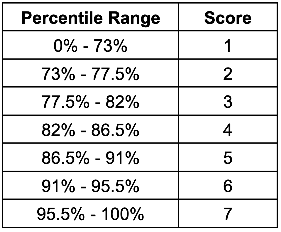
Because cyclones are geographically concentrated, aggregated loss rates are negligible across a significant fraction of the earth's land surface. The scoring system reflects this: locations below the 73rd percentile of the global distribution receive the lowest score of 1. Above that threshold, the remaining locations are differentiated using six uniform bands, each 4.5 percentage points wide, with a score of 7 assigned to locations above the 95.5th percentile. The complete scoring bands are shown in the table below.
Flooding Model Methodology
Flood risk assessment uses different data sources than cyclone risk, but the same risk equation. Risk is quantified as the product of event frequency, asset exposure, and expected loss. Event frequencies are derived from the return periods of flood hazard maps, rather than from observed event records, and are projected forward using precipitation data from CMIP6 simulations. Asset exposure at each flood frequency is determined by analyzing the spatial extent of flooding within each mesh cell. Expected losses per unit of asset value are calculated using empirical damage functions that relate flood depth to monetary damage. Details of the calculations and data sources are shown below.
Event Frequency
In flood modeling, the concept of event frequency is captured by flood plain maps that each correspond to a specific return period. Beehive does not perform proprietary calculations to identify these flood plains. Rather, flood hazard maps are sourced from academic, research, and government organizations, and combined into a composite hazard map. Using an ensemble of data sources partially mitigates the uncertainty associated with any particular source. For the most part, the individual hazard maps that are sourced provide water coverage and water depth estimates for their respective return period. The maps used in Beehive's assessments, which consider fluvial and coastal flooding, are,
JRC European River Flood Hazard Maps: Baugh et al. River flood hazard maps for Europe and the Mediterranean Basin region. European Commission, Joint Research Centre (JRC). (2024). https://doi.org/10.2905/1D128B6C-A4EE-4858-9E34-6210707F3C81
JRC Global River Flood Hazard Maps: Baugh et al. Global river flood hazard maps. European Commission, Joint Research Centre (JRC). (2024). http://data.europa.eu/89h/jrc-floods-floodmapgl_rp50y-tif
World Resource Institute, Aqueduct Flood Hazard Maps: Ward et al. Aqueduct Floods Methodology, World Resources Institute. (2020). https://www.wri.org/data/aqueduct-global-maps-40-data
GFPlain250m: Nardi et al. GFPLAIN250m, a global high-resolution dataset of Earth's floodplains. Sci Data 6, 180309. (2019). https://doi.org/10.1038/sdata.2018.309
Up to 7 return periods (flood frequencies) are considered within each mesh cell. For each return period, flood coverage and flood depth statistics are assigned to the cell by taking a weighted composite of statistics from the component flood maps. The composite considers both fluvial (river) and coastal flood sources, and the relative weights assigned to each source vary by region to reflect differences in data availability.
After baseline flood frequencies and depths are established, they are projected forward under each climate scenario using CMIP6 precipitation data. For each return period, a critical precipitation rate is identified from the baseline climate data — this is the precipitation rate whose historical frequency of occurrence matches the flood return period. This match is an approximation, since flooding can result from compound events that are not fully described by a single precipitation intensity. However, precipitation statistics are among the more robust outputs of global climate models, and they provide a physically grounded basis for projecting how flood frequency will evolve under changing climate conditions. CMIP6 simulation data is used to determine how frequently critical precipitation rates occur under each future scenario and time horizon. Changes in the precipitation frequency translate directly to changes in the flood frequency, allowing baseline flooding probabilities to be projected forward in time.
While powerful and informative, baseline hazard maps do carry uncertainty. Inter-comparison studies have shown that global flood models exhibit substantial disagreement: Trigg et al. (2016) found only 30–40% spatial agreement in flood extent across six global models applied to Africa, with the largest discrepancies occurring in deltas, arid regions, and wetlands. A subsequent comparison by Lindersson et al. (2021) of three global flood products reached similar conclusions at the global river basin scale, and noted that the choice of flood dataset can materially affect exposure estimates,
Trigg, M. et al. "The credibility challenge for global fluvial flood risk analysis." Environmental Research Letters 11, 094014 (2016). https://doi.org/10.1088/1748-9326/11/9/094014
Lindersson, S. et al. "Global riverine flood risk — how do hydrogeomorphic floodplain maps compare to flood hazard maps?" Nat. Hazards Earth Syst. Sci. 21, 2921–2948 (2021). https://doi.org/10.5194/nhess-21-2921-2021
The composite approach described above partially mitigates these map-to-map differences, but does not eliminate them.
Asset Exposure and Loss Rates
Asset exposure is modeled using the spatial extent of flooding within each mesh cell, as determined from the composite flood plain map. For each return period, the fraction of the cell that falls within a flood zone is used as a measure of asset exposure. Because not all land within a flood zone contains buildings, an exposure coefficient is applied to convert geometric flood coverage to an effective building exposure. This coefficient is calibrated so that aggregated regional loss estimates are consistent with reported annual flood losses.
Economic losses per unit of exposed asset value are calculated using flood damage functions that relate flood water depth to value loss. Separate depth-damage curves are used for residential, commercial, and industrial buildings, with each curve calibrated to the geopolitical region. These curves are combined using a weighted average based on the estimated fraction of each building type, producing a single composite damage estimate at each flood depth. A representative damage curve dataset is,
Huizinga et al. Global flood depth-damage functions. Methodology and the database with guidelines. EUR 28552 EN. (2017). https://data.europa.eu/doi/10.2760/16510
Additional flood exposure and loss rate data is sourced from FEMA's National Risk Index,
Federal Emergency Management Agency (FEMA) National Risk Index. Available at: https://hazards.fema.gov/nri/data-resources.
After losses have been calculated for each flood frequency, the per-frequency loss rates are integrated over all modeled frequencies to determine an overall expected annual loss rate, per unit of asset value. These annual loss rates are collected from all global locations and ranked to determine scoring thresholds. Scores are then assigned to each cell based on where the cell’s loss rate falls within those thresholds.
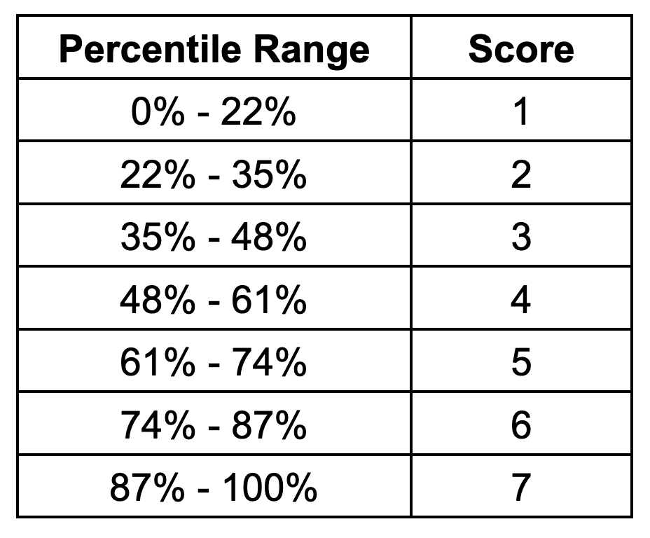
Flood risk, like cyclone risk, is negligible across a portion of the earth's land surface. The first scoring band reflects this by being wider than the other bands: locations below the 22nd percentile of the global distribution receive a score of 1. The remaining scores are assigned using uniform bands of 13 percentage points, so that a score of 2 spans the 22nd to 35th percentile, a score of 3 spans the 35th to 48th percentile, and so on. The full set of scoring thresholds is shown in the table below.
Wildfire Model Methodology
Wildfire risk assessment applies the same risk equation as the other hazard types. Event frequency and exposure are estimated using a machine learning model trained on global satellite observations of wildfires. The model is parameterized with climate statistics and land cover data, allowing it to represent the relationship between environmental conditions and wildfire activity. Once trained on historical data, CMIP6 climate simulations are used to project the model's results to each future scenario and time horizon of interest. Loss rates per affected asset are derived from empirical data and scaled to ensure consistency with reported damage numbers from insurance and government sources. Details of the calculations and data sets used for each risk component are below.
Event Frequency
Beehive estimates wildfire burn probability using a machine learning model trained on global observations of wildfire activity. ML approaches for projecting wildfire risk have been widely studied and applied in academic research, and examples include,
Di Giuseppe et al. Global data-driven prediction of fire activity. Nat Commun 16, 2918 (2025). https://doi.org/10.1038/s41467-025-58097-7
P. Jain et al. A review of machine learning applications in wildfire science and management. Env. Reviews 28 (4), 478 (2020). https://doi.org/10.1139/er-2020-0019
The quality of an ML wildfire model depends on the quality and scope of the training data describing both fire occurrence and the environmental parameters that influence it. The two wildfire observation sources used for training are,
Federal Emergency Management Agency (FEMA). National Risk Index. Available at: https://hazards.fema.gov/nri/data-resources.
N. Andela et al. The Global Fire Atlas of individual fire size, duration, speed and direction, Earth Syst. Sci. Data, 11, 529–552 (2019). https://doi.org/10.5194/essd-11-529-2019
The FEMA dataset contains burn probability estimates for the United States derived from a simulation campaign, while the Global Fire Atlas provides empirical burned area observations derived from MODIS instruments on NASA's Terra and Aqua satellites.
Land cover data for the model is sourced from,
M. Friedl and D. Sulla-Menashe. MODIS/Terra+Aqua Land Cover Type Yearly L3 Global 500m SIN Grid V061. NASA EOSDIS Land Processes Distributed Active Archive Center (2022). https://doi.org/10.5067/MODIS/MCD12Q1.061
GLC_FCS30D: the first global 30-m land-cover dynamics monitoring product with a fine classification system from 1985 to 2022 using dense-time-series Landsat imagery and continuous change-detection method." Earth Syst. Sci. Data, 16, 1353–1381 (2024). https://doi.org/10.5194/essd-16-1353-2024
Climate input data is sourced from the CMIP6 ensembles described in the modeling overview. A variety of climate statistics might reasonably be chosen to describe the relationships between climate and fire occurrence, and Yu et al. provide a reference point for understanding some of the options,
G. Yu et al. Performance of Fire Danger Indices and Their Utility in Predicting Future Wildfire Danger Over the Conterminous United States. Earth’s Future 11 (11) (2023). https://doi.org/10.1029/2023EF003823
Here, risk is assessed over years and decades, rather than over the days and weeks associated with weather forecasts. Consequently, the wildfire model is parameterized with annualized climate statistics rather than short-term weather data. The chosen statistics are:
95th percentile of daily max temperature, representing extreme heat exposure
95th percentile of vapor pressure deficit, representing atmospheric dryness
95th percentile of daily max wind speed, representing extreme wind conditions
75th percentile of rolling annual cumulative precipitation, representing overall wetness
2nd percentile of rolling 6-month cumulative precipitation, representing prolonged dry periods
After training on climate, land cover, human proximity, and wildfire observation data, the model can estimate burn probabilities for all SSP scenarios and time periods of interest by substituting projected climate statistics for the historical values used during training.
Asset Exposure and Loss Rates
Asset exposure represents the fraction of assets within a mesh cell that would be affected when wildfire occurs. It is statistically estimated using two factors: fuel connectivity, which reflects how readily fire can spread through the local land cover, and suppression capacity, which reflects the availability of firefighting resources and is proxied by population density. Loss per affected asset is represented by a fixed loss rate, applied globally. Because intensive rather than extensive losses are considered (see the discussion in the overview), the resulting annual loss rate is expressed per unit of asset value rather than in absolute monetary terms. It does not depend on the cumulative value of assets within a cell. Population density enters only as a proxy for fire suppression capacity, not as a measure of asset concentration. The population density data used here is sourced from,
Center For International Earth Science Information Network-CIESIN-Columbia University. (2018). Gridded Population of the World, Version 4 (GPWv4): Population Density Adjusted to Match 2015 Revision UN WPP Country Totals, Revision 11 (Version 4.11). Palisades, NY: NASA Socioeconomic Data and Applications Center (SEDAC). https://doi.org/10.7927/H4F47M65
The expected wildfire loss rate for each cell is the product of these exposure and per-asset loss rates, and the projected annual burn probability. The resulting rates (i.e. the annual expected loss per unit of asset value) are collected from all global locations and ranked to determine scoring thresholds. Scores are then assigned to each cell based on where the cell's loss rate falls within those thresholds.
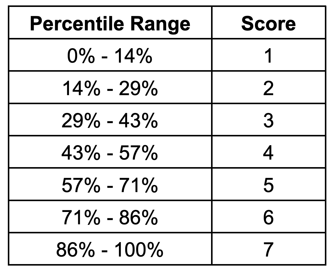
All seven scores span uniform bands of approximately 14 percentage points: a score of 1 is assigned to locations below the 14th percentile of the global distribution, a score of 2 spans the 14th to 29th percentile, and so on. The full set of scoring thresholds is shown in the table below.
Heat Model Methodology
Heat risk assessment follows a different approach than cyclone, flood, and wildfire risk. For some hazard types (e.g. heat and drought), economic impact strongly depends on the nature of the business operations that the assets support. These idiosyncratic dependencies make it difficult to define a loss function that generalizes across businesses. An organization whose members perform significant outdoor work, for example, may have fundamentally different economic exposure to heat than one whose members work largely indoors. Heat exposure is also not typically priced through insurance markets with the volume that cyclone, flood, and wildfire exposures are, making it more difficult to calibrate a broadly applicable loss rate. For these reasons, Beehive’s heat assessment scores physical heat stress rather than an estimated annual loss rate. In other words, the scores indicate the likelihood that assets will experience sustained heat stress. The composite metric that Beehive uses for scoring is derived exclusively from CMIP6 climate simulations. Details of the metric construction and scoring approach are described below.
While heat risk is assessed here using only physical climate information, this is not the only approach in the literature. A number of researchers and practitioners go a step further and connect temperature changes directly to economic impact. Representative studies include,
D. García-León et al. Current and projected regional economic impacts of heatwaves in Europe. Nat Commun 12, 5807 (2021). https://doi.org/10.1038/s41467-021-26050-z
M. A. Borg et al. Occupational heat stress and economic burden: A review of global evidence. Env. Research 195 (2021). https://doi.org/10.1016/j.envres.2021.110781
In the physical stress approach used here, one of the practical modeling challenges is that heat affects human anatomy in complex and interrelated ways. Researchers have consequently proposed a wide variety of heat stress metrics. Examples include,
K. Blazejczyk et al. Comparison of UTCI to selected thermal indices. Int J Biometeorol 56, 515–535 (2012). https://doi.org/10.1007/s00484-011-0453-2
R. G. Steadman. The Assessment of Sultriness. Part I: A Temperature-Humidity Index Based on Human Physiology and Clothing Science. J. of App. Meteorology and Climatology 18 (7), 861-873 (1979). https://doi.org/10.1175/1520-0450(1979)018%3C0861:TAOSPI%3E2.0.CO;2
As the existence of these studies implies, many reasonable choices exist when approaching the concept of heat risk or heat stress. The approach here, in an effort to capture generally applicable rather than precision-fit information, is to use a relatively straightforward composite definition, and assess how that stress evolves under a scenario and time horizon matrix.
Physical Heat Stress Assessment
Unlike the other hazard types, where CMIP data provides a major but only partial component of the risk metric, heat risk projections rely exclusively on CMIP6 simulation results. The composite heat stress metric is built from several temperature and humidity statistics, each of which captures a different dimension of heat exposure:
90th percentile of daily max temperatures
93rd and 98th percentiles of the 30-day rolling average of daily max temperature
93rd and 98th percentiles of the 30-day rolling average of daily max wetbulb temperature
Annual heat wave count (variant 1), defined as stretches of four or more consecutive days in which the daily max temperature is both at least 5% above the two-month rolling average and above 85°F
Annual heat wave count (variant 2), defined as stretches of four or more consecutive days in which the daily max temperature exceeds the seasonal 90th-percentile threshold
The first three statistics measure the severity of peak and sustained high temperatures, including the effect of humidity through wet-bulb temperature. The heat wave statistics capture the frequency of prolonged extreme episodes, which impose physiological and infrastructure stress beyond what a single hot day would produce. Together, these components represent the range of conditions most relevant to physical heat stress.
Risk Scoring
Each of the heat statistics listed above is first converted to a quantile rank based on its position within the global distribution of that statistic from the near-term (+1 year) time horizon. A weighted average of these quantile ranks is then calculated at each mesh cell, with weights chosen so that no single component dominates the composite and each contributes meaningfully to the result.
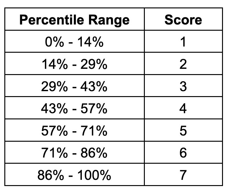
Because the heat assessment scores physical stress rather than an annual loss rate, no damage function or asset value estimate enters the calculation. The composite heat stress values are instead collected from all global mesh cells and ranked directly. Scores are then assigned to each cell based on where its composite value falls within the global distribution. The scoring thresholds are uniformly distributed: a score of 1 is assigned to locations below the 14th percentile, a score of 2 spans the 14th to 29th percentile, and so on. The full set of scoring thresholds is shown in the table below.
Drought Model Methodology
Drought and water stress, like heat, affect different types of businesses in very different ways. A business that uses water primarily for data center cooling might think differently about drought than an agricultural business dependent on rainfall for crop production. These differences make it difficult to quantify economic impact in a way that is broadly applicable across the business landscape. Consequently, Beehive assesses drought risk not by scoring dollar loss rates, but rather by scoring physical water stress. In other words, the scores indicate the likelihood that assets will experience sustained water stress conditions. The composite drought stress metric combines CMIP6 climate simulations with external datasets on drought indices and water consumption. Details of the metric construction and scoring approach are described below.
Drought characterization and modeling is well studied in the academic literature, and starting points for understanding the data and research landscape include the following papers. These three papers review, respectively, key concepts and indicators of water stress, mathematical approaches to drought modeling, and the environmental mechanisms through which drought risk may evolve under climate change,
A. K. Mishra and V. P. Singh. A review of drought concepts. J. Hydrol. 391, 202–216 (2010). https://doi.org/10.1016/j.jhydrol.2010.07.012
A. K. Mishra and V. P. Singh. Drought modeling – A review. J. Hydrol. 403, 157–175 (2011). https://doi.org/10.1016/j.jhydrol.2011.03.049
S. M. Vicente-Serrano et al. A review of environmental droughts: Increased risk under global warming? Earth-Science Rev. 201 (2020). https://doi.org/10.1016/j.earscirev.2019.102953
The approach here draws on several of these perspectives, combining them into a single composite metric. Beehive's assessment methodology integrates three distinct but complementary data streams to characterize global drought risk: relative drought conditions (SPEI), absolute water availability (precipitation), and water consumption.
Relative Drought: SPEI
Relative drought conditions are assessed using the Standardized Precipitation Evapotranspiration Index (SPEI), a multiscalar drought index that accounts for both precipitation deficits and increased evaporative demand. The SPEI builds upon earlier drought indices by incorporating temperature effects on evapotranspiration, making it particularly suitable for climate change assessments where warming trends amplify drought severity. The index methodology was originally developed and validated by Vicente-Serrano and colleagues,
S. M. Vicente-Serrano et al. A multiscalar drought index sensitive to global warming: the standardized precipitation evapotranspiration index. J. Clim. 23, 1696–1718 (2010). https://doi.org/10.1175/2009JCLI2909.1
S. Beguería et al. Standardized precipitation evapotranspiration index (SPEI) revisited: parameter fitting, evapotranspiration models, tools, datasets and drought monitoring. Int. J. Climatol. 34, 3001–3023 (2014). https://doi.org/10.1002/joc.3887
Beehive uses the 12-month SPEI timescale, representing medium-term hydrological drought conditions that affect water resources, reservoir storage, and groundwater recharge. SPEI values for each SSP scenario and time horizon are derived from CMIP6 simulations. These simulations provide a global measure of how drought intensity evolves relative to historical baseline conditions. SPEI data at 0.25° spatial resolution is taken from,
Araujo, D.S.A., et al. Global Future Drought Layers Based on Downscaled CMIP6 Models and Multiple Socioeconomic Pathways. Sci. Data 12, 95 (2025). https://doi.org/10.1038/s41597-025-04612-w
Data for each time horizon and scenario of interest is mapped from this source into the mesh cells that are used for risk scoring.
Water Availability: Precipitation
Water availability is characterized using annual precipitation totals derived from the CMIP6 simulation ensemble described in the Model Overview section. Precipitation data undergoes the same ensemble averaging process used for other hazard types, with 20+ member simulations aggregated for each scenario and time horizon. These precipitation data provide a complementary perspective to SPEI: while SPEI measures drought relative to local historical norms, absolute precipitation captures the approximate water input to a region. Areas with low precipitation may face water stress regardless of how the local water balance compares to historical baseline conditions, particularly when water consumption is high or steadily increasing. One limitation of this approach is that surface water transport from distant sources, such as rivers carrying snowmelt from distant mountains, is not explicitly modeled.
Water Consumption
Water consumption is quantified using the global dataset developed by Khan et al.,
Khan, Z. et al. Global monthly sectoral water use for 2010–2100 at 0.5° resolution across alternative futures. Sci Data 10, 201 (2023). https://doi.org/10.1038/s41597-023-02086-2
This dataset projects water use across multiple sectors (agricultural, industrial, and domestic) for the SSP scenarios used in IPCC assessments. The water use projections account for socioeconomic development pathways, population growth, technological change, and agricultural expansion. Water consumption is included because regions with high water usage can be vulnerable to supply deficits even when precipitation or evaporative demand shift only moderately. Water consumption data for each scenario and time horizon is mapped onto the same mesh cells used for the other drought components.
Risk Scoring
The three data streams are combined to quantify drought risk. SPEI and precipitation are converted to quantiles, weighted, and then summed to create a base metric. This base metric reflects SPEI's integration of both supply and demand factors while preserving sensitivity to absolute water availability through precipitation.
Water consumption enters the calculation in two ways. First, it acts as a multiplier on the base metric: at low water use levels, the multiplier is 1, while at high water use levels it increases to approximately 3, reflecting the escalating vulnerability of high-consumption regions to water supply disruptions. Second, water use contributes to the metric as a small standalone term, ensuring that high water consumption influences risk even in regions with a neutral water balance. After calculation of the final metric for each cell, smoothing constraints are applied to limit score volatility across scenarios and between time horizons, ensuring consistency in the temporal and spatial distribution of risk.
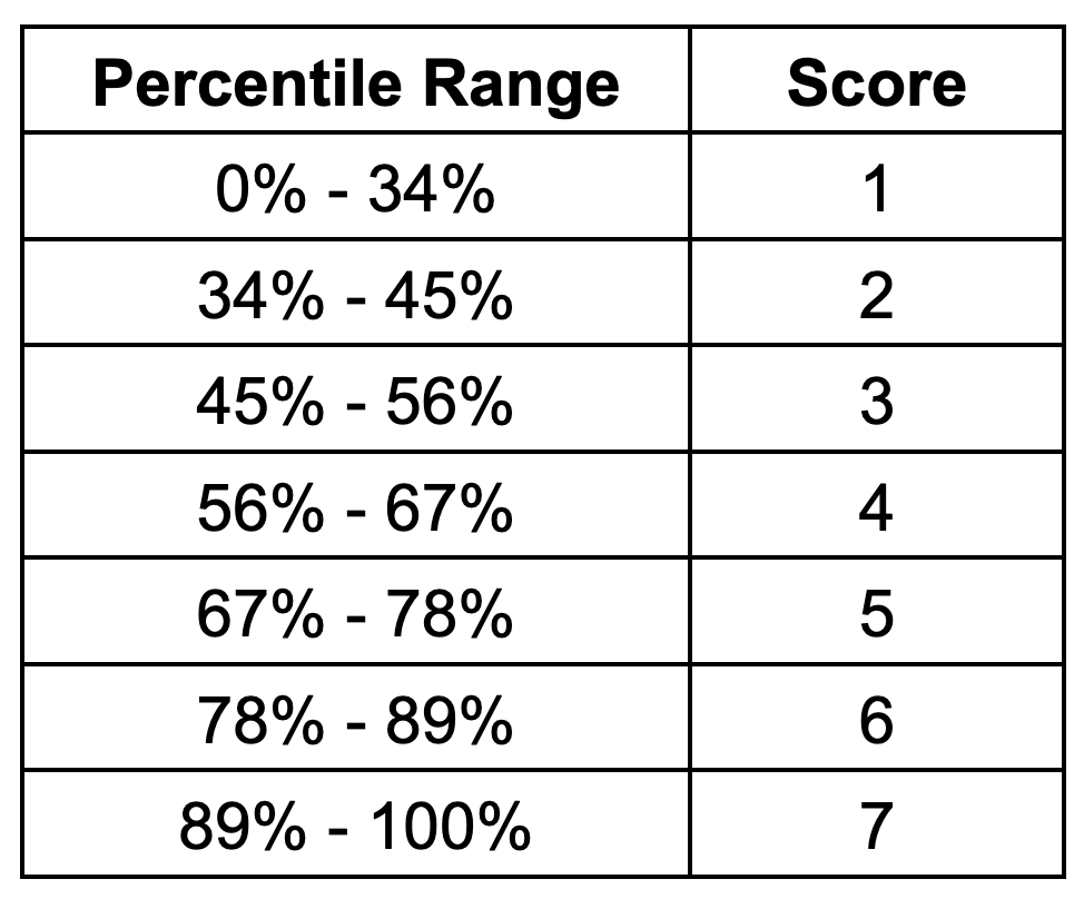
Because the drought assessment scores physical water stress rather than an annual loss rate, no damage function or asset value estimate enters the calculation. The composite drought stress values are instead collected from all global mesh cells and ranked directly. Scores are then assigned to each cell based on where its composite value falls within the global distribution. The first scoring band is intentionally wide, assigning a score of 1 to locations below the 34th percentile to capture the fraction of the globe with minimal drought risk. The remaining scores are distributed in uniform 11-percentage-point bands, from a score of 2 at the 34th–45th percentile through a score of 7 above the 89th percentile. The full set of scoring thresholds is shown in the table below.
FAQs
Modeling Approach
Which climate scenarios and time horizons does Beehive consider?
Beehive considers the following Shared Socioeconomic Pathways (SSPs) and time horizons:
SSP1-2.6 (low emissions), SSP3-7.0 (moderate), and SSP5-8.5 (high)
1 year, 10 years, and 30 years from the year 2025, when the assessments were most recently updated
What are Shared Socioeconomic Pathways (SSPs), and how does Beehive use them?
SSPs are climate change scenarios. They are conditional versions of the future associated with specific societal greenhouse gas emissions scenarios, and are used to understand how risk might vary across those scenarios. Beehive uses three SSPs to model how hazard risk evolves under different emissions futures, with SSP1 representing a scenario with relatively low emissions, and SSP5 representing a scenario with very high emissions.
What modeling techniques does Beehive use?
Beehive applies machine learning, statistical analytics, and ensemble climate modeling, depending on the hazard type.
How does Beehive estimate hazard frequency and severity?
Hazards are projected using CMIP6 simulations. Severity is assessed using loss functions (for floods and fires) and physical conditions (for heat).
How are Beehive’s physical risk scores or financial impact estimates calculated?
Quantitative and intensive economic losses (meaning, loss per unit of asset value rather than net loss) are estimated on a cell-by-cell basis, for risk types other than heat. These economic loss estimates are a function of modeled hazard frequency, asset exposure, and asset vulnerability, as described in the model descriptions above. For all risk types, the appropriate quantitative economic or physical metric is converted to a global relative score of 1 through 7 by sorting all metric values for each hazard type, and then setting cutoff percentiles within the sorted distribution which define the 1 through 7 scoring buckets.
What are the key assumptions behind Beehive’s physical risk models?
Climate variables influence hazard likelihood
Precipitation trends influence flood probabilities
Asset exposure is modeled in an aggregate fashion, rather than building-by-building
SSPs are an appropriate framework for evaluating climate-related risk ranges
What climate-specific datasets does Beehive use, and how does Beehive handle uncertainty in these climate projections?
Beehive uses Coupled Model Intercomparison Project Phase 6 (CMIP6) climate projection data, hosted by Google Cloud Public Datasets and accessed via zarr-consolidated stores (https://storage.googleapis.com/cmip6/cmip6-zarr-consolidated-stores.csv). The uncertainty associated with individual simulations and specific time periods is reduced by using an ensemble of 20 to 25 CMIP6 simulations, and by using a time window of plus or minus two years around the time horizon of interest, when forecasting climate statistics. Even with this treatment, the climate projections are inherently statistical and probabilistic in nature. They are useful for forecasting and understanding trends and risk ranges, but not for deterministically predicting the future.
What are the known limitations of Beehive’s current modeling approach?
Not yet building-specific
No economic correlation model for heat risk
Flash flooding not yet modeled
U.S.-derived loss data is extrapolated globally, when necessary
Validation and Accuracy
How does Beehive validate its models?
Model results are compared against historical records (e.g., FEMA, Global Fire Atlas) and academic benchmarks.
Does Beehive compare model results to historical disaster data or financial losses?
Yes—loss ratios and historical event data are used for backtesting and calibration.
How does Beehive ensure its methodology aligns with industry and scientific standards?
Beehive builds on established data sources, government and academic frameworks (e.g., CMIP, JRC, FEMA), and peer-reviewed methods.
How does Beehive plan to improve model accuracy over time?
Planned improvements include:
Flash flood and drought modeling
Higher spatial resolution
Global loss function coverage
Building-level modeling
Enhanced CMIP6 post-processing
Updates and Governance
How often does Beehive update its physical risk models?
Annually, with major updates released semiannually.
Who at Beehive is responsible for model governance and quality assurance?
The Chief Data Officer, supported by Beehive’s data science and climate modeling team.
Usage and Integration
How do customers typically use Beehive’s physical risk insights?
Climate disclosures
Enterprise risk management
Real estate, insurance, or supplier screening
Employee safety planning
How does Beehive support climate disclosure requirements under TCFD, CSRD, or California SB 261?
By providing time-bound, scenario-based physical risk data and audit trails suitable for reporting. Beehive also provides a transition risk assessment product and a reporting tool to generate a TCFD-aligned report compliant with global climate risk regulations.
What outputs do Beehive’s models generate?
1–7 risk scores by region, hazard, time, and scenario
Audit trails showing the underlying data used in the scoring calculations
Graphs, charts, and other visuals to understand a company’s risk exposure
What is included in Beehive’s audit trail, and why is it important?
Audit trails show the drivers of risk scores, including climate trends, hazard frequency, and exposure assumptions. This transparency supports customer trust, precise adaptation planning, and external disclosures.
Can users filter results?
Yes—by hazard, geography, scenario, and time horizon.
Does Beehive offer APIs or data exports for further analysis?
While Beehive does not offer an API, customers can access raw data through file downloads.
Legal, Privacy, and Disclaimers
Do Beehive’s models comply with major regulatory frameworks?
Yes. They are designed to support TCFD, CSRD, and SB 261 requirements.
Are model outputs legally binding or provided for decision support?
Outputs are decision-support tools, not legal guarantees. They are based on best-available science and data sources. The climate risk assessments and projections provided by Beehive are based on complex models and data analysis techniques that attempt to predict future climate-related events and risks. These projections are inherently uncertain and subject to numerous variables beyond our control.
Beehive does not guarantee the accuracy of any climate risk projections or assessments. The risk categorizations provided are best estimates based on available data and modeling techniques at the time of the assessment.